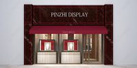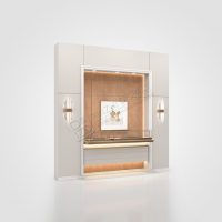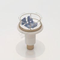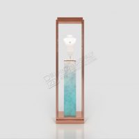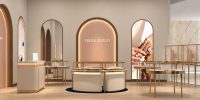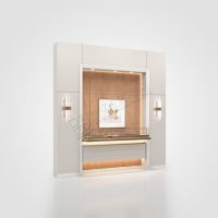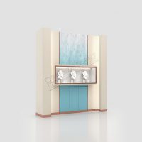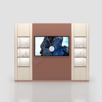

Color is one of the most powerful yet understated tools in jewelry store design. It shapes emotion, guides attention, and influences purchasing decisions. For high-end jewelry brands, the right color palette can elevate the entire shopping experience. Here is what goes into the art of color selection.
1. Creating the Right Atmosphere
Colors set the mood of a space. Warm tones like cream, beige, and soft gold create an inviting, intimate atmosphere that encourages relaxation and trust. Cooler tones like grey, navy, or charcoal convey sophistication and modernity. The choice should align with your brand’s personality and the emotional response you want to evoke.
2. Using Contrast to Highlight Jewelry
Jewelry, especially diamonds and gemstones, thrives on contrast. Dark backgrounds make bright stones pop, while light backgrounds create a clean, airy feel. Many luxury brands choose deep, rich hues like dark blue, charcoal, or velvet black for display areas to create a dramatic backdrop that makes the jewelry the undeniable hero.
3. Maintaining Brand Consistency
Color is a key element of brand identity. The palette used in your store should reflect your brand’s visual language—whether that is the classic elegance of gold and cream or the contemporary edge of black and white. Consistency across all touchpoints builds recognition and trust.
4. Subtle Accents for Personality
While the main palette should remain refined, subtle accent colors can add personality and energy. A pop of emerald green, ruby red, or sapphire blue can evoke the colors of precious gemstones and create a memorable visual experience.
5. Lighting and Color Interaction
Lighting changes how colors appear. Warm lighting enhances warm tones, while cool lighting complements cooler palettes. When designing your store’s color scheme, consider how your lighting will interact with the walls, floors, and display cases. The goal is harmony, not conflict.
6. Zoning with Color
Color can be used to define different zones within the store. A quieter, more intimate seating area might use softer, warmer tones, while a high-energy showcase area might use bolder contrasts. This zoning helps guide customers through the space naturally.
7. Materiality and Texture
Color is not just about paint—it is also about materials. Wood, metal, glass, and fabric all have their own colors and textures. The interplay between these materials adds depth and richness to the overall design.
8. Cultural Considerations
Color associations vary across cultures. For example, red symbolizes luck and prosperity in some cultures, while white represents purity in others. For brands operating in international markets, understanding these cultural nuances is essential when selecting a color palette.
Conclusion
Color in jewelry store design is not arbitrary—it is strategic. The right palette enhances the jewelry, reinforces brand identity, and creates an emotional connection with customers. In the world of luxury retail, where every detail matters, color is one of the most powerful tools at your disposal.